

Rather than starting from scratch, you will probably want to convert some presentations you already have into an interactive resources. This guide will take you through the process step by step, using a short presentation as an example. The presentation we will use is intended to be delivered face to face, and includes several places where the instructor would demonstrate something practical to the students. At each point, you can download a copy of the presentation to see how the functionality was built. Although this page is more about the thought processes behind converting a presentation into an online resource, there are short videos that run you through the complicated steps.
The starting point
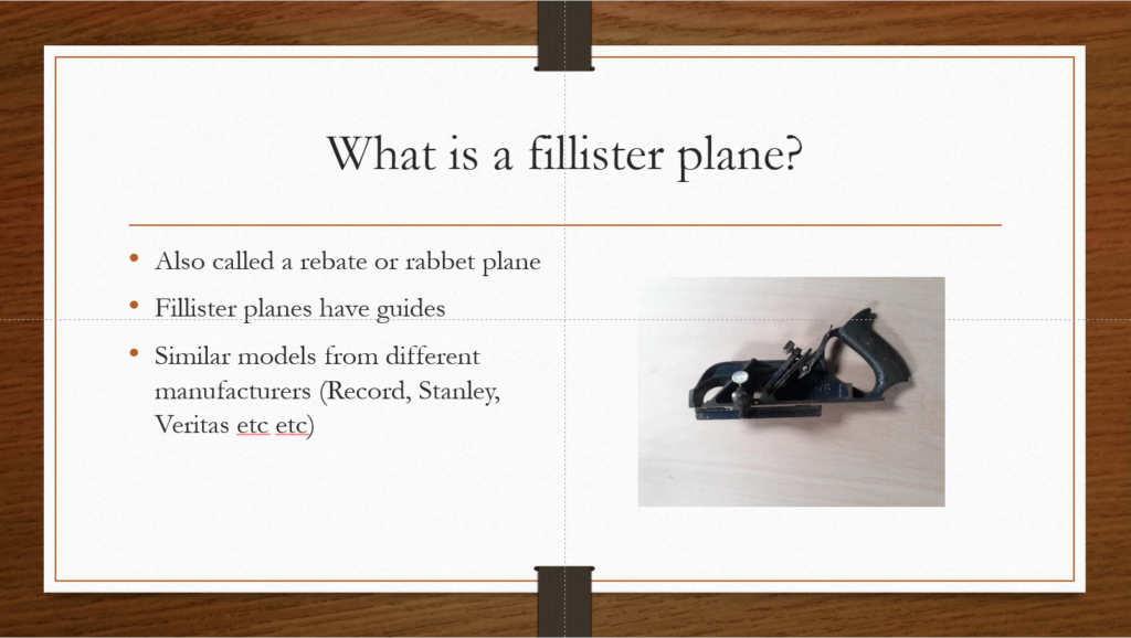
The starting point is a simple, short presentation. As it is for presenting face to face, the written content is mostly notes and there are some slides with only images that the instructor would talk through.
If this was placed online in this format, students would struggle to meet the learning objectives as specified.
Step 1: Expanding content
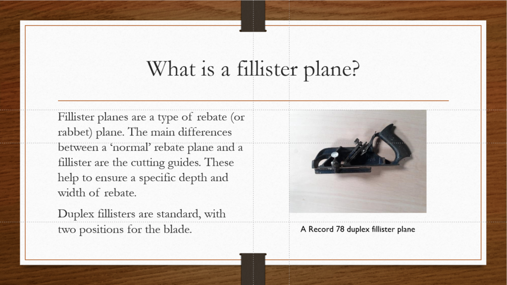
The first thing that needs to be done is make the content suitable for independent study. The presentation is substantially lengthened, and the written notes are expanded. Captions are also added to each image. Links to videos demonstrating things that would be shown in the face to face version are also added.
This version is more suitable for learning online, but is very much a passive experience. Users have a single path through the resource.
Step 2: Adding navigation options
To increase the number of learning paths, and to make the resource feel more like an online resource than a presentation, the next step is to add hyperlinked navigation. There are two parts to this.
Linear navigation
The first part is adding next/back buttons with hyperlinks to the next and previous slides. These are simply text boxes with arrow symbols. A contrasting colour makes them stand out from the content of the slide. Using hyperlinks to ‘Next slide’ and ‘Previous slide’ rather than to a specific slide means the buttons can be copy/pasted between slides and remain functional.
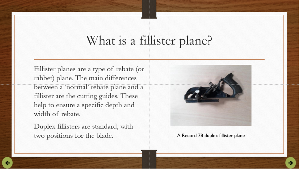
If you have several slides it can be quicker, as here, to add the buttons to the slide templates using the Slide Master. This automatically adds them to all slides of that type.
You may also wish to turn off advancing slides on click in the Transitions menu. This forces users to navigate with the buttons you provide, and avoids any miss-clicks advancing the slide. If you do this, the final slide will need a button to close the show. This is done by adding an Action to an object (a shape or textbox, for example). You may also want to disable the pop-up toolbar in the presentation. You can do this in Set Up Slide Show in the Slide Show ribbon, changing the ‘Show type’ to ‘Browsed at a kiosk’. If you have navigation buttons on the Slide Master, you can put this button over the top of the final Next button, or use a different slide layout that does not have the buttons on. In the example presentation, navigation buttons were added to the most commonly used layouts, which did not include the ‘Title only’ layout. The final slide uses that layout, so different buttons could be added easily.
Branched navigation
The second set of navigation options allows users to choose the order in which they go through content. This allows for easier exploration, and facilitates review of a specific piece of content.
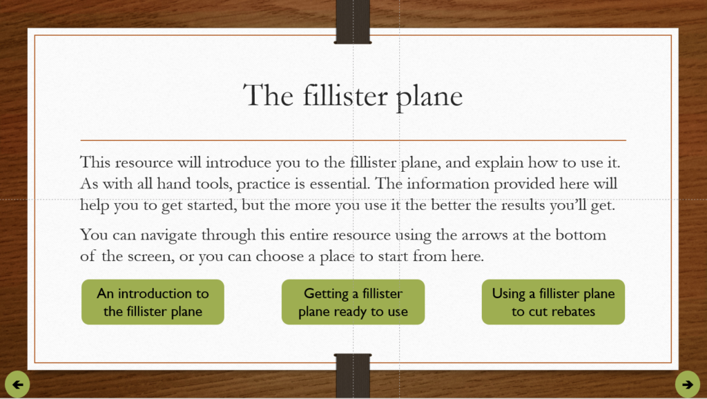
In this presentation, the learning objectives and the presentation structure show it covers three topics. Buttons with hyperlinks to the start of each topic are added to the introduction slide. This allows direct navigation to each section. At the end of each section, there is another button to return to the introduction and choose again. These buttons are again simply text boxes, with a contrasting fill colour and a different font to the resource’s main text to help them stand out.
Step 3: Interactive content
The final stage is to add interactivity where necessary. In this presentation, there is a slide with a set of images that would be talked through in the classroom. Although this can be mimicked using labels and arrows, with just a little extra effort it can be turned into an interactive resource with triggered animations.
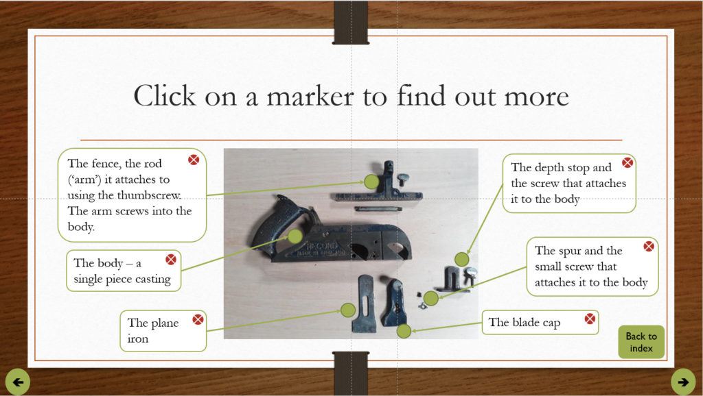
An alternate version of this could be used as a quiz question, with users asked to identify a specific part, and the text box providing feedback.
The scheme in this case is simple. A marker is placed at each relevant point on the image, with an instruction to click a marker to find out more. When the marker is clicked, additional objects (a text box, arrow, and close icon) appear. When the close icon is clicked, those objects disappear again.
To make this work, an ‘Appear’ animation is added to each object that needs to appear when the marker is clicked. A Trigger is then set on those animations, linked to the marker. A ‘Disappear’ animation is then added to each object, with the Trigger set to the close icon. Using the Selection Pane to rename each object makes this much simpler. In this case each marker, text box, arrow, and icon is renamed with the object type and part of the image. The parts for the spur are named Spur marker, Spur text, Spur arrow and Spur close, for example, which makes it easier to identify each part in menus.
Further steps
This does not need to be the end. This presentation could be further improved by linking or embedding videos demonstrating some processes. Some narration could also be added in places if useful. Triggered animations could also be used to create simple quiz-style elements.
Once the resource is finalised, it can be saved as a PowerPoint Show and uploaded to Blackboard for use by students.