
Getting going with the editor
The editor in Blackboard is located in each and every tool or button you can work with; as such, the information that follows is relevant throughout Blackboard.
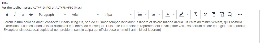
The content editor may look like this when you first enter:
Press the ellipsis (…) symbol on the right-hand side to expand the toolbar:
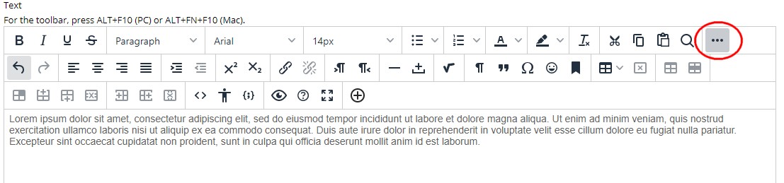
The expanded editor includes the original basic features (bold, italics, underline, font, size, etc). The expanded menu includes additional formatting tools, the ability to add links, images, videos, and attachments and much more. You can find more information on each tool in the editor here.
We don’t recommend changing the general paragraph size, fonts or colours, as to do so in one area means you will have to replicate this everywhere in your course. Be kind to yourself and stick with the basic settings for things such as paragraphs!
Activity: Practice using the editor
Add several paragraphs worth of text into the editor. If you would like some exemplar text to play with, make sure you are logged into Blackboard and click here.
- Designate some text as a paragraph
- Create some subheadings within the item
- Add in a bullet point list
- Check out how you prefer your text to look (aligned left/right/centred/justified?)
- Decide how you would like to highlight important text
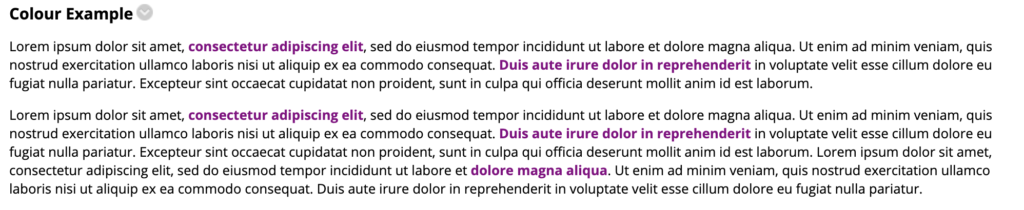
Top Tip: Choosing a professional colour scheme
If you want to use a colour to designate important text, choose a single colour and choose a darker version of that colour. Bright red/purple/blue stands out but makes things look a little like a non-stylised rainbow. Choose a single colour and have it a bit subdued to enable it to fit in with the design; make it bold if you need to. You need to consider the best colour combinations for accessibility, such as colour blindness and reading disorders.
Example 1: All the colours of the rainbow
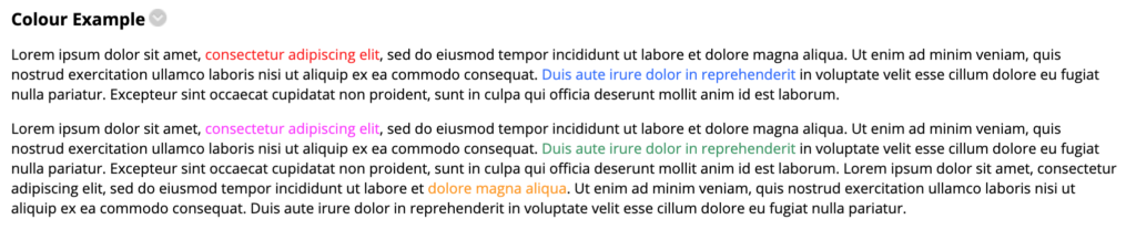
Example 2: One single consistent colour
Want to learn more about colour?
To learn more about using colours to make professional-looking content, check out this podcast on choosing colours from Visme. While Visme focuses a little on presentations, the lessons of this podcast are still perfect for anyone trying to make more professional content.
Next: Adding images or icons…